created April 18, 2005 · complexity basic · author Bernhard Leiner · version 6.0
Here are some recommendations for fonts to use in gvim, particularly for writing programs.
TO DO
- Should probably have separate tips for Linux and Windows font recommendations, or at least make it clearer what works where.
- Every font should have a screenshot and note if it is free or commercial.
Proggy
Proggy Clean font from http://www.proggyfonts.com/
Using gvim with gtk2, I had a problem installing Proggy Clean. I couldn't get the pcf font registered by freetype/fontconfig. The result was that I could select Proggy Clean via "xfontsel", but not with the gtk2 font selector. A gtk build probably would have worked.
Anyway, the ttf font works fine. Just copy ProggyCleanTT.ttf to ~/.fonts and run "fc-cache" once. This should work on every Unix system with fontconfig installed.
Then start gvim and and choose the font, or insert this in your .gvimrc:
set guifont=ProggyCleanTT\ 12
The 12pt size is necessary for a good look. On OS X, you need to set 16pt.
If you use ProggyCleanTT in gvim and the top of the font looks like garbage, with missing pieces, it is because you have the new freetype hinting turned on. Proggy is not hinted properly.
Neep
I prefer the Neep programming font created by Jim Knoble. Get the jmk-x11-fonts package from http://www.jmknoble.net/fonts/
It differentiates between a zero and the letter "O" and looks really nice. I use it for programming on a 1600x1200 screen.
On Debian: apt-get install xfonts-jmk
On Gentoo: emerge x11fonts-jmk
Once you've installed the font you should put a line like this in your .gvimrc file:
set guifont=Neep\ 18
zevv-peep
I've been using Neep, but the characters are too small on a new laptop with a high resolution screen (1920x1200 at 15.4"). Zevv-peep is a variation on Neep for hires screens. X11 (Linux) and Windows variants are available at http://zevv.nl/play/code/zevv-neep/
Design considerations
- Clean, avoid clutter.
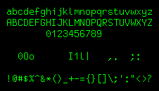
- Very clear distinction between similar characters like 0 O o and i I l 1 |.
- Suitable for light text on a dark background.
- Not too densely packed to allow a good separation between characters.
Other
- Terminus from http://www.is-vn.bg/hamster/jimmy-en.html
- Crisp from TODO: Where is this?
set guifont=Crisp:h12
- ProFont from http://www.tobias-jung.de/seekingprofont/
- Triskweline from http://www.netalive.org/tinkering/triskweline/ – a superb programming font, however it has no slashed zero.
- Bitstream Vera family of fonts from http://www.bitstream.com/font_rendering/products/dev_fonts/vera.html
set guifont=Bitstream\ Vera\ Sans\ Mono\ 13.
- Deja Vu family, based off Bitstream Vera with greater range of supported characters: http://dejavu-fonts.org/wiki/index.php?title=Main_Page
- Dina from http://www.donationcoder.com/Software/Jibz/Dina/
See also
- 158 Using Computer Modern TT as a gvim font under Windows
- 414 Change guifont to see more of your file
- 484 Console-like fonts for Windows GVim
- 632 Setting the font in the GUI
- 774 Gtk gvim and fontconfig
- 889 Nicer looking fonts on MacOSX
Comments
I don't like any of these fonts on hires screens. They are too small on a 1600x1200 panel. Normally I use Lucida Console 12 pt.
On Windows, I use the Terminal font at 6 pts. However, it's a DOS font and that makes non English letters display all wrong. But I use it anyway because it maximizes my screen usage.
How about the common 7x14-ISO8859-1 font? The only thing I'd change is to replace the zero with a slashed one (using FontForge). http://www.ank.com.ar/fonts/
My favorite fonts are 10x20/X and fixedsys/Windows, always clear and crisp.
As has been noted, sometimes font size 16 is better for Proggy Clean.
On a Linux system, it can be useful to tell fontconfig to turn off antialiasing for specific fonts. Just create a file named .fonts.conf in your home directory with the following content:
<?xml version="1.0"?>
<!DOCTYPE fontconfig SYSTEM "fonts.dtd">
<fontconfig>
  <match target="font">
    <test qual="any" name="family">
      <string>ProggyCleanTT</string>
    </test>
    <edit name="antialias" mode="assign">
      <bool>false</bool>
    </edit>
  </match>
</fontconfig>
The proggy ttf didn't work well for me on FC3. Characters weren't scaled smoothly and looked jagged.
I instead prefer these Microsoft TrueType fonts: http://www.mjmwired.net/resources/mjm-fedora-fc3.html#ttf
Install the rpm and then use andale mono. They look lovely and are scaled and smoothed perfectly.
set guifont=Andale\ Mono\ 9
I've been using a monospace font (not necessarily programming-oriented though) called Inconsolata, available here.